In ancient times, it is said that “Advertising is the soul of the business” and the backbone of any business that wants to find its way to the market, and whoever makes itself known and above all lasts over time. Thus, investing in large advertising campaigns is what all entrepreneurs should do, even in times of crisis. Henry Ford kept saying, “A man who stops advertising to save money is like a man who stops a clock to save time”. Therefore, to be successful, you need to be well-known, special, and memorable. Then, what is the first thing associated with the company image? It is the logo; it is the one of the fundamental aspects of a company’s brand. The logo represents the business card of any company; it embodies its spirit and philosophy, which is the idea that should be conveyed to the client, based on the correct combination of images and words, graphically attractive, which can represent a synthesis of the essence of a particular company and what it does. Thus, designing a logo is a key and sensitive moment when starting a professional activity, underestimating its importance is a mistake that should be completely avoided.
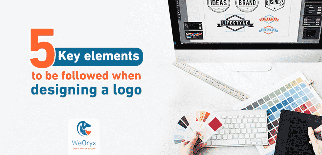
Why is it important to have a logo for your company?
The major global brands based on a good percentage of their wealth on the logo, which over time has become a symbol of the quality of company products; human is an emotional and rational creature, and the appropriate “correct” logo capable of taking advantage of these two aspects will be a successful logo capable of transmitting positive feelings and values to the client, which drives him to choose one brand over another. Designing a logo is now a process that anyone can implement, it only requires a computer and Internet, that’s all: The network is full of sites that allow it to be created, while having the ability to create something does not really mean having the ability to do it, since visualizing a successful logo, stays effective and imprinted in the mind.
The major features of the company logo:
So, what are the key characteristics that a noticeable logo should have? In this article, we will see some techniques and tricks for designing a successful logo.
Simplicity:
To get something easily identifiable, focusing on simplicity is a good strategy. Each element should have a very specific significance and role, then avoiding any unnecessary and redundant part: Just think of the Nike logo or the Apple logo, they are all simple but wonderful at the same time.
Significance and Purpose:
The Good logo should suit the target audience and in line with what company wants to reflect and present. In brief, it should be able to function and achieve goals set by the company. For instance, Amazon logo with the arrow moves from A to Z refers to the company ability to provide customers with any item from A to Z.
Ingenuity:
Besides being descriptive and genuine, the logo should be effective and should consider the visual effects and aesthetic simplicity in a way that imprint on minds of customers. All these factors should be merged in balance taking in consider its various purposes, basics and different aspects of “trademark”. Therefore, it should be easily developed in terms of color, size for different media and devices as: business card, banners, company website, packaging without never losing its “attractiveness”.
Uniqueness:
There is no company that is exactly the same as others, therefore, there should not be logos that resemble or refer to the same graphic concepts which individually connect the audience and customers to the products or services of such company. Thus, this enhances the perception of stability in market. Whether it has a unique style or individual shapes, the successful logo will be able to stand out of crowd.
Beauty is not enough to sell:
With a sense of responsibility that allows you to work on a “unique” project, designing a logo means taking a close look at the entire world that revolves around a company. Study and research to design a logo is an imperative; the logo designed and created by a group of professionals becomes a distinct graphic mark to communicate its existence in the market, to effectively distribute and sell products and services.
WeOryx choose colors and precise shades of logo after performing studies, researches, experiments which include study of domestic and international competitors, and not by coincidence. This is non-skippable stage to create an effective logo.
What emotions does designing a logo evoke?
The most important factor is whether the design of logo reflects the company personality and identity. Emotions evoked by logo design should be in consistent with company values. For example, Disney logo evokes happiness and cheerfulness and the nice curved line suits an animation company for children, but it is not suitable for a company seeks to make sales.
Designers should understand the psychology of colors and effects of fonts on the good logo design. For example, green color brings relaxation and usually reflects growths, health and environment. On the other hand, red provokes danger and emotions. The same with fonts as Garamond, Helvetica, and Comic Sans which bring about different emotions. Serif font such as Garamond enhances the idea of respect and traditions; therefore, it is suitable for environment that seeks integrity such as universities or publishing houses. Sans serif font such as Helvetica are clear and modern, thus, it suits technology companies. Non-formal fonts such as Comic Sans are used by entertainment companies such as toy companies. Therefore, the good understanding of the psychology of colors and the effect of fonts is considered significant for designing an effective logo.
1. What does Logo mean?
Behind every good logo a story. Putting the company name in a general manner is not a good design for the logo. This is why choosing ready-made templates is a bad idea. Designing a logo should have a significant story. Good designers thoroughly understand the company culture, vision and the tune of products at first before start creating the idea of logo. The final result of logo has to reflect the company philosophy and values.
2. Will the logo withstand the test of time?
How would the logo look in two, ten or twenty years? Designers should avoid fashionable trends, sharp fonts trends and flat shades as these patterns may not withstand the test of time. Simplicity is much more better than complexity as a simple logo design may be unforgettable for even twenty years without referring to time.
4. Is it unique? Is it immediately recognizable?
A good logo design is distinctive, memorable, and recognizable. Even if you only see it once, you should be able to recognize it after a while.
3. How does it look in white and black?
When we start designing a logo, we always start with white and black. Designing in that way allows you to make sure that a given logo can be easily recognized through its look and design not through its color. Strong logo is the logo that is memorable because of its outlines. Monochromatic logo has the advantage of using your trade mark easily through multimedia and different backgrounds.
4. Is it clear and distinctive in a zoom out view?
Another way to ensure that the logo is simple and recognized is to zoom out. Even in low accuracy modes, strong logo is recognized at a glance. This can also test whether the given logo is simple or no as you can still identify logos as of Nike, McDonalds, and Twitter in zoom out view.
Re-designing the logo:
Definitely, re-designing a logo is much more complex than designing a logo from scratch. In this process, trade mark is updated to look new and innovative, in a same time be in line with the company history, considering traditions, company objectives in addition to adding the company products or services in the market benchmark. Also, re-designing a logo and changing trademark can be combined together or with strategic repositioning of company or its products or services in the market, but this is another subject that can be addressed in a separate article.
5. Why is using a free logo design not recommended?
When using a free logo maker on Internet or typical image created without defined purpose, you expose your company to the risk of losing connectivity between the essence of the company and image it represents. Designing unsuitable logo for the customer objectives and values is considered as a risk that trademark should not incur. Lack of originality, exclusiveness and adaptation can result in creating a negative image in mind of target customers about the company products or services.
Why WeOryx company can be your ideal choice?
- We believe that passion and adherence make the difference when creating a brand. Whether you are an entrepreneur who needs to design a logo for your business or if you want to re-design its current image, you will find at WeOryx the solution suitable for what you seek.
- We work closely with customers to be able to get clear idea about the concept and the values of trademark. We listen carefully and make suggestions suits their needs and objectives. We try to achieve what they are searching for; in addition, we can manage our work according to your budget by providing different options for you to choose from.
Conclusion:
Logo is the story of “self”, it is the authentic unique signature of company and its establishment process. It has specific rules, techniques and theories that combine art, aesthetics, and style. When designing a logo, you should have a closer look on the area or community that revolve around the given idea starting from design to development, from production to distribution and reflect the company features, products or services through a unique “mark” in the market. This is why the logo is considered as a business card as well as the synthesis of philosophy, products, and unique style of company- whether small or large- sized, industrial or commercial, stores or service company, professional public or private company. They all are in need for convincing logo to communicate with audience and potential customers.
 Uncategorized